Corporate Identity

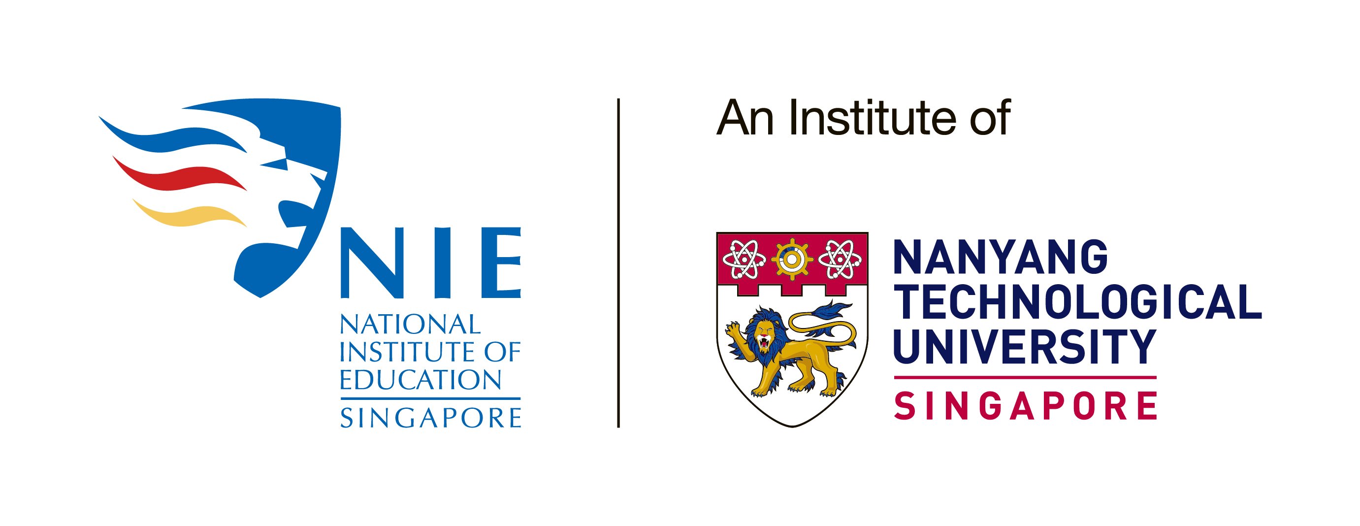
The NIE NTU composite logo was introduced in 2018 to brand NIE closely with our parent university.
NIE's publicity material including building banners, NIE website and event banners carry the composite logo as shown below.

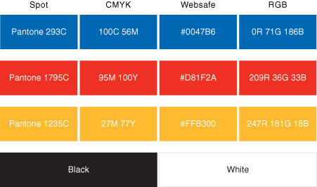
The corporate colours described here follow the international Pantone Matching System (PMS), with equivalents for Process, Websafe and RGB illustrated. Note that process colours do not always present accurate colour expressions, hence using PMS inks for reproduction work is advisable.

A clear, distinctive typographic style used consistently across our corporate communications can support our effort to project a coherent message to our audiences.
Care should be taken to ensure that all typefaces are never condensed or expanded. Proper line, letter and word spacing should be used for all running text to ensure good readability.

Primary Typeface
Our primary typeface is Optima, selected for its clarity and legibility. It should be used consistently across all corporate communication materials such as brochures, posters and banners.
Optima is most appropriately used for headlines, as well as titles.

Secondary Typeface
Our secondary typeface is Helvetica, selected for its clarity, legibility and contemporary appeal. It should be used consistently across all corporate communication materials such as brochures, posters and banners.
Helvetica is most appropriately used for body copy.

Administrative Typeface
Our administrative typeface is Arial, selected primarily for its compatibility with most computer systems, and also for its clarity and legibility. It should be used consistently for administrative purposes and in the general office environment such as letters, reports, presentations etc.
For matters related to corporate identity and its applications, kindly contact:
Public, International and Alumni Relations at [email protected]
